Saturday, February 13, 2010


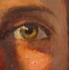
How to paint an Eye


The biggest mistake my students make in our Portrait Painting class when painting an eye, is that they try to illustrate and dissect all the parts of the iris, pupil, etc instead of painting it as a whole. Let me explain:

1. Paint out the entire eye socket with a dark color (Transparent red oxide and ultramarine blue)--think of a skeleton and the cavity of the eye socket.

2. Paint around the eye leaving the dark color as the line of the lid. A simple stroke of a a mid value will describe the eye lid., and continue underneath the eye and surrounding area.

3. Since the eyeball and eye are already almost black, let that be the dark part of the iris. Simply mix the eye color and place your brush on the inside of the cirlce.

4. The whites of the eye are never white! Use a muddy skin tone with either a hint of black or a hint of blue. Start darker than you think. Light usually hits one side of the eye stronger than the other


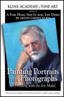
We just finished our first DVD on painting Portraits.

It's a 4 hour program -live demo and is packed with painting tips and lessons.
I made it out of frustration-my students were not progressing as I thought they should so I decided to put the instruction on DVD. I made them watch it before class and I was shocked at their instant progress. Hmm. "They'll listen to the TV but not me."

Monday, November 16, 2009

Kline Academy Student, Xavier Gonzalez wins Memorial Award at Culver City Art Show


Every year the Culver City Art group holds their annual art exhibit
featuring over 24 artists. This year we are proud that one
of our K.A Artists, Xavier Gonzalez won the Memorial Award
for his entry, Peasant boy on a stool; a master copy based on Bartolomé Esteban Murillo.
It is a beautifully painted canvas in warm earth tones with masterful blends and edges.
Xavier is a young artist who is working on perfecting his technique
in classical painting. I am sure this is the first of many of awards to
come for this promising artist.

Wednesday, September 23, 2009

Working with foils...ahhh guilding


I feel like a kid sometimes when I work with foils. I love shinny things. But somehow when I introduce gilding into my work, I am transported back to a romantic time when gold and silver adorned the finest paintings and icons. It was used then to exaggerate the light/holiness of God or the Saint who was being painted.

I am using it in this painting to exaggerate a similar idea. For the last year and a half, I have been working on a series of icon inspired paintings and researching pre-christian- judeo religions where the feminine played the dominant role.

I used this set-up for my new painting and I thought it would be a perfect lesson for our Portrait Painting class that I teach on Wednesdays from 2-5pm. The stage was set with a shinny silver back-drop, Sara, our model wore a beautiful Asian red robe. The colors reflecting in her skin are beautiful.
I started the class off with a demo on how to block in the standing form. I had everyone prime their canvas with a cool medium gray. This time, I tried a new approach to see if it would help the students to achieve more accurate proportions. We predetermined the head size and marked off 7 1/2 head lengths on the canvas. (Sara's height). This helped most of those who were doing a full figure to stay within correct proportions. Next the block-in which concentrated mostly on the silhouette--no features, no detail. AND NO WHITE. I can't believe how hard it is for some to stay away from white in the beginning but trust me, if you concentrate on all the shadow shapes, connecting half tones and mid tones, you will be so much happier with the results.
I paint with and ahead of my students in order to give them a range of solutions to the many problems that arise in portrait and figure painting. This painting of Sara, "The Goddess" is almost finished and shows our students some of the color choices I made for shadows and skin tones. I jumped ahead of them by using photographs so I could study anticipate some of the challenges they will encounter. As an instructor you can't just talk the talk...you better know how to use the brush too!

In working with foils it is important to introduce the foil layer before the painting is finished. The reflected light is so intense that it obliterates all your other lights. After I applied the foil, I went back in to adjust my lights and intensify my darks using transparent glazes of Alizarine Crimson and Ultramarine Blue and Egyptian Violet. In the strongest whites, I am using an egg tempera mixture which I will explain later.
Here is the almost finished piece.

Monday, July 6, 2009

Progression of a Portrait


I finished "Mom's" portrait in February of this year and I have to say it is so much easier to paint someone you know really well.
Mom has Parkinson's disease and typical with that disease is the blank stare. Even though she still manages now and then to crack a sarcastic joke, she is really becoming less and less able to communicate. In this portrait I wanted to capture the reality of her situation. I guess my inspiration was Whistler's Mother, Arrangement in Grey and Black. Mine however is titled "I did the best I could." Meant to be a message to those who have selfishly left their parents to fend for themselves in their dark days. It is agony to see your Mother in a state of helplessness and vulnerability. I do the best I can and see her often and of course pay for her care but it really takes a village and we all need as much help as possible to care for our elderly. It is a gift to do service for others even when they were not saints. If we all just "... did the best we could."

Friday, July 3, 2009

Kline Academy Releases Portrait Painting DVD


We are SUPER EXCITED about our first in a series of instructional DVD's that illustrate the excellent teaching offered at Kline Academy.

Kline says it best: "I designed this program because I had a student (one) drop out due to frustration. She just couldn't "get it." My ego does not allow for defeat. So I stayed up nights trying to develop a system that would be understanding to any personality with any background, skill, whatever and came up with this system. And guess what? It really, really works! I actually tested the raw video on my students. I made them watch for 30 minutes then go back into the studio and paint and WOW! We were all amazed at their progress.
I am not claiming that just by watching the DVD you will become a great portrait artist. What I am claiming is that you will be better than you were."

This four hour DVD is a live demonstration filmed on location at the Kline Academy of Fine Art. Cheryl Kline will take you step by step in her unique process of painting portraits from a photograph. There are so many lessons in this DVD you will want to watch it again and again!

Secrets Revealed! This DVD will teach you how to:
  • Find facial proportions
  • Set your composition
  • Draw your model on the canvas
  • Block in the basic shapes
  • Define the shadow patterns
  • Mix beautiful skin tones
  • Refine edges
  • Painting Hair
  • Painting Drapery
  • Finishing touches
  • and much more....
Regardless of skill level, this instructional DVD wil enable the artist to approach their next portrait project with a step by step system which will bring more success to the development of their painting techniques and practice.

"Artists of all abilities will definitely learn something from watching this. Throughout the demo Cheryl inserts gems of information that might not be gained from many hours of practical classes. She is a natural teacher and gifted artist who gererously shares her experience and skill in this demo." Barbara Rae, Professional Artist, Royal Academician, London

"I just finished watching Cheryl Kline’s video “Painting Portraits from Photographs & Finishing with the live Model.” It is so compelling. From beginning to end, the video shows the step by step method of painting from the palette, mixing the paint, drawing the initial structure, placement of the different values and then finally finishing it by looking at the live model. One of the most valuable parts of the video is to see how she uses a limited palette to produce so many colors and how to apply those colors. It is also about really seeing. Any novice or experienced painter could learn so much from this video." Judith Corona
Professional Artist, Adjunct Professor of Art, Otis College of Art + Design, UCLA Extension, Los Angeles

To Order: Call Kline Academy at (310)927-2436
$99.00

Saturday, February 7, 2009

Kline Academy News


Okay, Im a bad blogger, I have not been keeping up with this and I apologize
But here is an update.

UPCOMING WORKSHOPS:

Mono Print FUN Day, Feb 16, Monday 10am to 5pm $125.
We will provide all oil based inks, you bring your own paper and some personal items for reference. This is an instant gratification day so be prepared for Christmas in February because each print is a surprise and accidents and the unexpected make for fantastic prints. Limited to 5 people call today. (310) 927-2436

Action Painting The Figure with Stephen Wright, All day Saturday in March (call for start date) $125
This workshop will explore the ideas of figurative artists in thetwentieth century, centering on three of the giants in the figurative field; Giacometti, Bacon and Freud. This will be a fun and informative day, focusing on getting students to break out of their traditional painting techniques and explore their subjective sensibilities. The focus is on freedom, passion, experimentation and excitement.

Figure Drawing made easy! Wednesdays 11am - 1pm $40 per class Starts Feb. 18
Your instructor, Esmeralda Acosta will take you on a gentle journey to successful figure drawing by giving you a one, two, three approach to drawing the live, nude model. Esmeralda instructor has studied with the best figurative artists in town and has and has dedicated her life to drawing and perfecting her skills...we are lucky to have her! You will achieve success!

Tuesday night un-instructed drawing workshops 7:30pm to 10:30 pm. $20 for one time or prepay for 4 times and get 1 free.
Angie, our animation expert, started "Get-the-Lead-Out" (http://gettheleadout-workshop.blogspot.com/) for anyone who wanted a place to draw the live model on the west side of town. The difference with our workshop from others, is that all of ours are themed with a costume and simple set. Our’s costs a little more then the neighborhood YMCA but we are using top models from "The Gallery Girls" and in our space you can sit closer than most settings. Themes range from "Geisha Vampire" ... "Insane Asylum" ..Tank Girl." Call or just drop in

Outdoor Landscape painting with Gary Blackwell, BFA, Distinguished Pastelist, Plein Air Painter. Fridays at 10am - 1pm $50 per class (pre-paid monthly)
This month, we will be exploring neighborhood painting- "It's a beautiful day in the neighborhood" will take on a new meaning when we show you how to capture the magic of an urban street. Many artists have made their fame painting these scenes like Wayne Thiebaud, Edward Hopper, and many others. This class is a bargain as you will be learning from an award winning artist who gives you more than 100%.

Foundation Drawing for Painters saturdays 9:30am - 12:30pm- $50 per class (pre-paid monthly)
This classis a great way to either begin your venture into art or to enhance the art skills you already have. This is an in-studio class with an easy-going atmosphere. We teach you how to "see" and draw all the troublesome forms, core shadows, cast shadows and reflected lights, etc that present themselves in all paintings and compositions whether you are drawing/painting people, landscape, still life or abstract.

The Atelier Workshop Mondays from 11am to 2pm -$60 per class (pre-paid monthly)
This all encompassing class will transport you to a typical renaissance studio where artists are doing many things. Hal Yaskulka, your instructor is Rembrandt reincarnated! We have a live nude model for those more advanced students who are working on anatomy, figure drawing and painting, Cast head drawing in Charcoal, old master painting copies and de-constructions in gray, along with still life painting and how to grind your own paint also in the same studio. Each exercise will be designed to bring you closer to the ultimate challenge of live figure painting and how to be a better figurative artist. This is the same studio atmosphere that many of the masters before us engaged in to become great artists. Hal will teach you how to draw from a simple "envelope" to more advanced form development, demonstrating almost every time so that you can see how it it is done. He will also show you a simple palette and how to achieve easier skin tones if you are painting the model. The class is on-going and there is a discount when you sign up for 3 months at a time.

Also Ongoing at The Kline Academy
Portrait Painting, Classical and Contemporary, Wed 2pm to 5pm, $60 per class (pre-paid monthly)
Currently we are recreating "Girl with a Pearl Earring" Our live model is perfect for the roll and students get to stand 2 to 3 feet from the model which makes skin tones much easier to achieve. Next month we will be working on an Ingres inspired portrait with a model from the Gallery Girls who looks like she just stepped out of a painting! Join us...we have 2 spaces left.
(310)927-2436

We also have Foundations in Classical Painting on Wed eve and Thursday morning, and Contemporary painting on Thursday evening.


Monday, November 17, 2008

The Portrait Society of America Hosts Artist Morgan Weistling


I was honored to be asked to volunteer for this event to help with the set up and
to also critique portfolios with Johanna Spinks, The California Ambassador for the PSA.
While we were setting up, I was imagining what Morgan would look like. I had briefly visited his web site and was not impressed with his subject matter Americana and and western era. A judgmental quality in my personality I am trying to overcome.
I was impressed with his drawing and painting skills and frankly I wanted to see what the hype was all about.
Especially since I heard that Morgan sells his pieces for thousands of dollars and can't paint them fast enough!

So in walks Morgan. Holy sh_t! Cute as a button! Late 30's or early 40's, regular kinda guy, baseball cap, jeans.
Okay I thought, let's see what this guy can do. His model was an older man, cowboy hat and bandana, good etched lines in his face, and sad eyes. Perfect for a demo.

The room was a buzz with 100 artists all wanting to sit as close as possible. Morgan began with a simple outline in ochre. He had prepared the canvas with a medium ground. He works on acrylic ground because he said he likes the tooth since linen with oil ground tends to be too slick. The audience couldn't help themselves blurting out comments and questions throughout the demo. Morgan didn't miss a beat. He was the most entertaining artist I have ever heard. He had us laughing and mesmerized for the entire 3 hours!

Every stroke of thick paint Morgan applies is specific and purposeful. No broad strokes and blending. He applies thick strokes of paint using a #6 or small brush, one stroke next to the other. He must have spent 3/4 of the time just on the eyes.Someone asked why he painted his chosen subjects- Morgan said "because tank tops and tennis shoes don't inspire me."

See the progression Below:

Wednesday, September 17, 2008

Impressionism: Painting the Light


During my painting trip to Florence I saw the most interesting exhibit at the Palazzo Strozzi

Painting Light is not just another Impressionist exhibition – it examines some of the most famous artists and their techniques of the last century, looking for clues as to where the paintings were made, under what conditions and, in some cases, by whom. The exhibition brings together over sixty masterpieces by Matisse, Van Gogh, Signac, Sisley, Berthe Morisot and Renoir and others from the Wallraf-Richartz Museum Foundation Corboud, Cologne, and other museums.
The exhibition opens by introducing the visitor to the turbulent world of the mid-19th century. Academic salon painters held the upper hand, but a new movement was afoot, and new theories of color were doing the rounds. Drawing inspiration from the theories of Goethe and Helmholz, scientists and painters alike were asking how they could capture ‘impressions’ – the fleeting perception of life as it happened – and put it down fresh and spontaneous on canvas. Here the visitor can compare the canvases of Jean Jacques Henner and other salon painters with the radical new style of Monet’s Maison à Failaise, brouillard (1885) and Caillebotte’s Le Coteau de Colombes (1884).
The Impressionists were not only pioneers in style, they were first and foremost innovators in technique. They were interested in "the new science." How the eye perceives light and assembles it optically. This interactive exhibition invites the visitor to look at the paintings using modern technology – with high-power microscopes, under infra-red and ultra-violet light – in order to discover the secrets of the Impressionist and Post-Impressionist artists. It explores such as aspects as how the artists conveyed the quality of light at different times of the day and which conditions inspired them the most, what materials and work methods they used, where the painting was done (for example one painting even has sand in the paint confirming it was executed en plein air while others recreated outdoor scenes in the shelter of their Paris studios) as well as the history of the paintings.
It was an eye-opening exhibit for me, being the realist snob that I am.

For more info go to: http://www.impressionismofirenze.it/

Painting by Theo Van Rysselberghe 

Wednesday, July 16, 2008

Kline Mom - #2 Work from Photo

July 15, 2008

I decided to work a bit more on the painting from a photo, before I drag Mom back in.

Sometimes you just need some "history" on the canvas. Its good to build up some paint. What I have done was to establish the lines by adding highlights to the skin. I know what you are thinking...if you add lines, meaning darker color. But, what most people miss is that lines in a face are similar to painting drapery folds. They are made up of highlights an half tones so in this case, my under painting acts as the darker value and all I did was to add highlights on top.

I am also working to establish the wrinkled skin (Mom's going to kill me) but it tells a story about the model, in this case it is necessary. And, since I am not being paid for this painting and I don't have to please anyone but me, I can make this an honest painting. I like that!

So in this next picture, you will see that I made the hand much bigger. It was bugging me and I had spent some time on it and the more I looked, it was too small---so--- destruction! Don't be afraid to destroy a part of your painting if it is not right no matter how much time you have spent on it. You will, I promise you, spend much more time regretting that you did not fix it.

This is a rough block in and her fingers are bent - so once it is finished, it will look accurate. It may also be slightly exaggerated since the hand is the closest to the viewer, I do want to force the perspective. My next step will be to work on the other hand and body, establish the chair, and then have Mom back for a live setting.

Until then.

Wednesday, July 9, 2008

Family Portraits and KLINE'S MOTHER

Yesterday, a friend brought my Mother by my studio for a visit and I said I would take her home. I wasn't ready to stop painting, so I set Mom in a chair and decided to paint her. I did a painting of her years ago and I love the piece entitled "Enigma" see below

Cheryl Kline, Enigma, Oil on Canvas, 1995

Anyway, I have been wanting to document her aging process and show the wrinkles, in all its earned glory the changed posture, her millions of thoughts inside that has accumulated over 82 years. How do I paint that?
So, here is the first 30 minute sitting:
I will update weekly or when ever I can get Mom to sit.

Here is a photo I took of the pose.


Okay, here is the first block in. My first challenge was that I can't get Mom to sit on a high chair due to health concerns so I had to sit while painting so I could be at a better level with her. As it is, I am still looking down a bit and I prefer to be at eye level.

Oh well, it must be this way..so I grabbed a blank white canvas. It was all I had, normally I never paint on a white canvas. I had black on my palette, so I used it to draw an outline or cartoon like drawing. Also, she was wearing all black...so I thought this would be good to use to quickly get some paint on and block in her clothes.

The background was very ochre-y so I used black, ochre and white to get rid of the white background.
Then I noticed that her skin is very pink (but not a warm pink) so I used alizarine and white with a dab of naples (my naples-Sennelier) to quickly block in her pink skin.

The next step was to add a bit of shadow to Mom's neck and side of her face so English red was the perfect choice. I like to use English red with Ultramarine Blue and white as a shadow color. This time though, I had some Egyptian Violet I was trying for another painting and I added that. I like the cool value it gave me. When you first start a portrait, its important to really notice what is unique about the person. What are their most distinguished features. Over the years, I have noticed that Mom has lost her upper lip and the lower one protrudes. Also, her eye lid droops a bit. I think that just getting those 2 things, helped to achieve a likeness right away. I would never be concerned with details but I am impatient like the rest of you and want instant gratification-- so if a few suggestions help me to see the likeness - I go for it. Its when we allow ourselves to be consumed with details and small brushes and too many color choices that you get yourself in trouble. And Frustrated. When I see students come in with a palette full of colors, it is just a matter of time before I hear them say "I'm having trouble mixing this color." My reply is usually "I would too with that palette"
Limit the number of colors you use and then use the exact same palette every time you paint. Think about it. In the printing process, there are only 4 colors. Cyan, Yellow, Magenta and black. Everything printed is made from a combination of those 4.

A typical Renaissance palette is White, Yellow Ochre (not too dark), French Vermillion, and Ivory Black. Many times I will stick to this palette and in my Portrait Class they will start theirs this way too. Hal Yaskulka's Figure Painting class also uses this palette.

So back to "Kline's Mother" I think this first sitting was successful and I will continue to post the progress. Mom is a very willing sitter which helps a lot!