Monday, November 17, 2008

The Portrait Society of America Hosts Artist Morgan Weistling


I was honored to be asked to volunteer for this event to help with the set up and
to also critique portfolios with Johanna Spinks, The California Ambassador for the PSA.
While we were setting up, I was imagining what Morgan would look like. I had briefly visited his web site and was not impressed with his subject matter Americana and and western era. A judgmental quality in my personality I am trying to overcome.
I was impressed with his drawing and painting skills and frankly I wanted to see what the hype was all about.
Especially since I heard that Morgan sells his pieces for thousands of dollars and can't paint them fast enough!

So in walks Morgan. Holy sh_t! Cute as a button! Late 30's or early 40's, regular kinda guy, baseball cap, jeans.
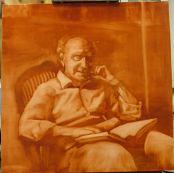
Okay I thought, let's see what this guy can do. His model was an older man, cowboy hat and bandana, good etched lines in his face, and sad eyes. Perfect for a demo.

The room was a buzz with 100 artists all wanting to sit as close as possible. Morgan began with a simple outline in ochre. He had prepared the canvas with a medium ground. He works on acrylic ground because he said he likes the tooth since linen with oil ground tends to be too slick. The audience couldn't help themselves blurting out comments and questions throughout the demo. Morgan didn't miss a beat. He was the most entertaining artist I have ever heard. He had us laughing and mesmerized for the entire 3 hours!

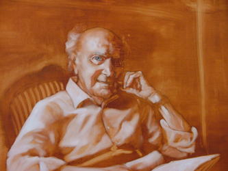
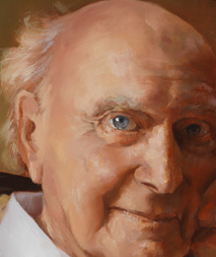
Every stroke of thick paint Morgan applies is specific and purposeful. No broad strokes and blending. He applies thick strokes of paint using a #6 or small brush, one stroke next to the other. He must have spent 3/4 of the time just on the eyes.Someone asked why he painted his chosen subjects- Morgan said "because tank tops and tennis shoes don't inspire me."

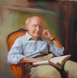
See the progression Below:

Wednesday, September 17, 2008

Impressionism: Painting the Light


During my painting trip to Florence I saw the most interesting exhibit at the Palazzo Strozzi

Painting Light is not just another Impressionist exhibition – it examines some of the most famous artists and their techniques of the last century, looking for clues as to where the paintings were made, under what conditions and, in some cases, by whom. The exhibition brings together over sixty masterpieces by Matisse, Van Gogh, Signac, Sisley, Berthe Morisot and Renoir and others from the Wallraf-Richartz Museum Foundation Corboud, Cologne, and other museums.
The exhibition opens by introducing the visitor to the turbulent world of the mid-19th century. Academic salon painters held the upper hand, but a new movement was afoot, and new theories of color were doing the rounds. Drawing inspiration from the theories of Goethe and Helmholz, scientists and painters alike were asking how they could capture ‘impressions’ – the fleeting perception of life as it happened – and put it down fresh and spontaneous on canvas. Here the visitor can compare the canvases of Jean Jacques Henner and other salon painters with the radical new style of Monet’s Maison à Failaise, brouillard (1885) and Caillebotte’s Le Coteau de Colombes (1884).
The Impressionists were not only pioneers in style, they were first and foremost innovators in technique. They were interested in "the new science." How the eye perceives light and assembles it optically. This interactive exhibition invites the visitor to look at the paintings using modern technology – with high-power microscopes, under infra-red and ultra-violet light – in order to discover the secrets of the Impressionist and Post-Impressionist artists. It explores such as aspects as how the artists conveyed the quality of light at different times of the day and which conditions inspired them the most, what materials and work methods they used, where the painting was done (for example one painting even has sand in the paint confirming it was executed en plein air while others recreated outdoor scenes in the shelter of their Paris studios) as well as the history of the paintings.
It was an eye-opening exhibit for me, being the realist snob that I am.

For more info go to: http://www.impressionismofirenze.it/

Painting by Theo Van Rysselberghe 

Wednesday, July 16, 2008

Kline Mom - #2 Work from Photo

July 15, 2008

I decided to work a bit more on the painting from a photo, before I drag Mom back in.

Sometimes you just need some "history" on the canvas. Its good to build up some paint. What I have done was to establish the lines by adding highlights to the skin. I know what you are thinking...if you add lines, meaning darker color. But, what most people miss is that lines in a face are similar to painting drapery folds. They are made up of highlights an half tones so in this case, my under painting acts as the darker value and all I did was to add highlights on top.

I am also working to establish the wrinkled skin (Mom's going to kill me) but it tells a story about the model, in this case it is necessary. And, since I am not being paid for this painting and I don't have to please anyone but me, I can make this an honest painting. I like that!

So in this next picture, you will see that I made the hand much bigger. It was bugging me and I had spent some time on it and the more I looked, it was too small---so--- destruction! Don't be afraid to destroy a part of your painting if it is not right no matter how much time you have spent on it. You will, I promise you, spend much more time regretting that you did not fix it.

This is a rough block in and her fingers are bent - so once it is finished, it will look accurate. It may also be slightly exaggerated since the hand is the closest to the viewer, I do want to force the perspective. My next step will be to work on the other hand and body, establish the chair, and then have Mom back for a live setting.

Until then.

Wednesday, July 9, 2008

Family Portraits and KLINE'S MOTHER

Yesterday, a friend brought my Mother by my studio for a visit and I said I would take her home. I wasn't ready to stop painting, so I set Mom in a chair and decided to paint her. I did a painting of her years ago and I love the piece entitled "Enigma" see below

Cheryl Kline, Enigma, Oil on Canvas, 1995

Anyway, I have been wanting to document her aging process and show the wrinkles, in all its earned glory the changed posture, her millions of thoughts inside that has accumulated over 82 years. How do I paint that?
So, here is the first 30 minute sitting:
I will update weekly or when ever I can get Mom to sit.

Here is a photo I took of the pose.


Okay, here is the first block in. My first challenge was that I can't get Mom to sit on a high chair due to health concerns so I had to sit while painting so I could be at a better level with her. As it is, I am still looking down a bit and I prefer to be at eye level.

Oh well, it must be this way..so I grabbed a blank white canvas. It was all I had, normally I never paint on a white canvas. I had black on my palette, so I used it to draw an outline or cartoon like drawing. Also, she was wearing all black...so I thought this would be good to use to quickly get some paint on and block in her clothes.

The background was very ochre-y so I used black, ochre and white to get rid of the white background.
Then I noticed that her skin is very pink (but not a warm pink) so I used alizarine and white with a dab of naples (my naples-Sennelier) to quickly block in her pink skin.

The next step was to add a bit of shadow to Mom's neck and side of her face so English red was the perfect choice. I like to use English red with Ultramarine Blue and white as a shadow color. This time though, I had some Egyptian Violet I was trying for another painting and I added that. I like the cool value it gave me. When you first start a portrait, its important to really notice what is unique about the person. What are their most distinguished features. Over the years, I have noticed that Mom has lost her upper lip and the lower one protrudes. Also, her eye lid droops a bit. I think that just getting those 2 things, helped to achieve a likeness right away. I would never be concerned with details but I am impatient like the rest of you and want instant gratification-- so if a few suggestions help me to see the likeness - I go for it. Its when we allow ourselves to be consumed with details and small brushes and too many color choices that you get yourself in trouble. And Frustrated. When I see students come in with a palette full of colors, it is just a matter of time before I hear them say "I'm having trouble mixing this color." My reply is usually "I would too with that palette"
Limit the number of colors you use and then use the exact same palette every time you paint. Think about it. In the printing process, there are only 4 colors. Cyan, Yellow, Magenta and black. Everything printed is made from a combination of those 4.

A typical Renaissance palette is White, Yellow Ochre (not too dark), French Vermillion, and Ivory Black. Many times I will stick to this palette and in my Portrait Class they will start theirs this way too. Hal Yaskulka's Figure Painting class also uses this palette.

So back to "Kline's Mother" I think this first sitting was successful and I will continue to post the progress. Mom is a very willing sitter which helps a lot!


Wednesday, June 18, 2008

The Right Tool


Once upon a time I met an artist in one of my classes who was painting little landscape-ish paintings. She said she hated what she was doing... using the tiniest brushes to describe every detail from her source image. So, I asked her "who do you like?" She said "Turner." I said "give me your brush." And then I handed her a palette knife and said "from now on, you only use a palette knife."

I had no idea how one simple adjustment could make such a dramatic change in ones art. I am always telling students to "get a bigger brush" but this was different. Gay Summerrick is a Fine Artist who took the challenge and changed the way she paints and even adjusted her approach to painting. Because with palette knife paintings, its not the overall colors that are important -like the color of the sky or the water or the trees. Its what's underneath that counts!

It's the bit of red or that spec of golden color that appears in between and in places that you can't plan for it to be. It is as if light has filtered through and is pulling everything together. Its the vibration of the colors underneath their primary colors that make the painting pop and for you to say "oh yea, this is good... really good."

When you see Gay's paintings up close, you will see what I mean. Gay has won awards from the Malibu Art Association, and excepted into juried shows with The California Art Club. She also shows at Los Angeles County Museum of Art Sales and Rental Gallery.

Needless to say, I am very proud of her.
Below are some of her landscapes: click on images for detail


Wednesday, May 14, 2008

Kline Academy Instructor GARY BLACKWELL wins Special Award

Gary Blackwell, Title: Friends, Size 11 x 14 Surface: Wallis paper

Kline Academy Instructor GARY BLACKWELL
wins Special Award and Cash Prize
from The Pastel Society of the West Coast


Gary Blackwell, a Signature Member of the PSWC and was given a special award for his entry "Friends" pastel on paper during The PASTELS USA 22nd Annual International Open Exhibition at the Haggin Museum in Stockton CA. The show runs from May 18 to June 22 and is sponsored by the Pastel Society of the West Coast.

Winning competitions is not new to Blackwell - a few years ago he earned the title of "Distinguished Pastelist" after winning three awards in succession in this same competition.


Tuesday, April 15, 2008

Cheryl Kline Receives "Certificate of Excellence" Award from The Portrait Society of America

Cheryl Kline Receives "Certificate of Excellence" Award

Last weekend, The Portrait Society of America held their 10th annual Art of the Portrait conference in Philadelphia, PA.

Over 800 artists from around the world attended. The days were filled with lectures and demonstrations from the most renown portrait artists living today.

Highlights included:

Thursday 4x4 demonstration featuring Jamie McMahan, Wende Caporale, Dawn Whitelaw and Timothy Thies.

Friday morning John Howard Sanden demonstrated. Then, Friday afternoon classes featuring Michael Shane Neal, Rose Frantzen, Calvin Goodman, Wende Caporale, Ying-he Liu, Judith Carducci, Dawn Whitelaw, Chris Saper, Ross Merrill, Robert Liberace, Edward Jonas, Anthony Ryder, Timothy J. Clark and Daniel Greene.

On Saturday, Everett Raymond Kinstler gave an incredible lecture. He talked about the fact that most great portrait artists all painted other things besides portraits. And how important it is to explore nature from life. Most of the great portrait artists (Sargent, Zorn, Boldini, and others) used only 5 to 8 colors to create their masterpieces!

"When you paint hair, make believe you have a comb in your hand."

He gave many other gems while creating this study:

"There are no short cuts"

"All art is feeling"

and

"Be careful of cleverness"

Burton Silverman followed with this demonstration of a model which he painted in about 2 hours!

Burt began over an old paint as his underpainting, "it causes you to be zoned in and more focused"


He started drawing (with paint) with a reddish brown and alizarine very dry paint as an outline to set up the composition on the canvas. Like magic, the figure began to appear. He made a point to keep the shadows transparent (thinned with oil) and many times wiped out the area after applying the paint to actually stain the area with a hue. Then he started the half tones in the face and added the warm color on the nose then the highlight. He worked very fast and slowly built up the impasto highlights. The blond hair was achieved with a reddish undertone and then put the highlights on top.

On Saturday afternoon, Aaron Shikler spoke for an hour about his life as an artist. What a character, all of these speakers had stories to tell about presidents and royalty they painted.

David Leffel closed the day speaking about "finishing' a portrait".


"Finishing is the stretch between the gaps...edges..." This was such a fascinating demo.

First of all Lefell had no model, this was all from memory.

He started with the dark area around the eye, He called this his yin and yang of the eye- "have lights mass and darks mass." His palette consisted of Burnt umber, ultra marine blue, pthalo blue, venetian red, cad orange, yellow ochre and white.

By painting the dark area first he established all the shadows, then, just like sculpting he began to add the mid values that create the lid and around the eyes. The skin under the eye is a warmer red. He connected the white of eye to the lower lid then went in later to add color to the white of the eye on the inside. It was almost orange in tone and I was waiting for him to "fix" it but it all came together. He talked about how to make the eyes transparent and how light will hit one side of the iris.

Regarding solving problems: Instead of softening a shadow transition he said instead, "to take their attention away or divert it to a light next to it."

"Highlights starts crisp and has a tail which (tapers off) and relates it to the surface."

"The dark part of the eyebrow starts under the brow ridge and has a grayer, cooler color by the bone because it is turning in."

"You use more color on the tip of the nose and less color to make it recede." Also by graying out the receding areas and areas that turn the face , you can get a better illusion of the modeling. The under planes are usually cooler.

"Part of closing up the gaps is making other areas stronger"

And more gems..... "Every form begins and ends. "When light hits, it starts..." "Hard edges follow soft edges" "A hard edge is closed, a soft edge is open"

"Front planes are warm, side planes are cool"

It was a fantastic demo, later another artist, Letticia and I were in the lobby bar and Burton Silverman and his friends joined our table and I had the excellent opportunity to further discuss his process and his ideas on finishing a painting.

Saturday night was our Gala Celebration and black tie banquet. When they called my name, I was so proud and humbled to be among the 30 recipients of an Award and be among some of the finest artists in the country. They show your winning image on 3 huge screens in the banquet hall. The 1st prize went to a sculptor at our table, Amy Kann.

To see all the prize winners and the top portraits go to http://www.portraitsociety.org/


This is a bad picture, but I was still walking on clouds and couldn't hold still. Thats Daniel Graves on the left and Charles Cecil on the right.

Later that evening we again went to the lobby bar and Daniel Graves, founder/director of the Florence Academy of Art (the best place I ever studied) was there and also Charles Cecil Founder/director of Charles Cecil Studios. Both of them were honored for An Award of Excellence in Education for their incredible contribution to the studies of figurative art in a classical atelier.

Our last day featured two internationally known artists, Daniel Greene and Nelson Shanks.

Nelson Shanks was another incredible speaker and talked about his work with Princess Diana and their friendship and his many other commissions of well known people. I was so exhausted I didn't take notes. Later we (800 of us) were invited to visit Nelson Shanks atelier/ Studio Incamminati. Where he teaches classical art in a 10,000 square foot space. They had a generous buffet prepared, a portrait demo by some of his teachers and the unveiling of Nelson Shank's latest work.

After that I ran to see the Cecilia Beaux, American Figure Painter exhibit at the Pennsylvania Academy of Fine Arts- incredible! I'm sure if she had been a man, her fame would have been as Sargents.

I highly recommend this conference for next year which will be held in Washington DC.


Saturday, March 29, 2008

Anatomy Of A Portrait

Dr. Wiengarten is the husband of one of my students. Every time I saw him (usually at one of my shows) I knew I had to paint him. He had such a rascal look about him, his thinning white hair, his gentle smile and those eyes! You could see a lifetime in those old soul, blue eyes. One evening I went over to their house and set up a quick photo session. "Where's your favorite chair" "Is that your book?" and with a few adjustments, I knew I had a good shot.

A Note about photo set-up:

When I photographed him, I didn't like the impression of him being looked down upon so I adjusted my view to just below his eye level. Traditionally, commissioned portraits of royalty required the artist's eye level to be lower then their subject, today when an artist sets up a portrait, it depends on what you want to say about your subject and what would be the most flattering position.

Anatomy of a portrait:

Step one: after the drawing, the canvas was covered in red oxide and then the images strongest lights and halftones where "subtracted" or wiped out with a cotton rag.

Step two: The gray stage- the painting was reworked with a value study to describe the various values.

Step three: I got bored with my usual gray study and went right to color. I painted all night I was on such a high, blasting the salsa music to feed my frenzy. I found that I could actually use the "full spectrum painting" idea in this painting quite well. For instance - his shirt would be boring if I stuck to the usual blue tones throughout. In full spectrum painting, as long as you match the same value and temperature,
you can put almost any color your want next to each other and it will make the painting more exciting and alive.

The shirt has pinks, yellows, greens and violet tones, even though the overall coloring is blue those additional colors make it pop.


I used the same idea on his head and for the final touches, the eyes, I had Dr. Wiengarten come in for a live sitting. I needed that glint in his eyes and that curl in his lip. You cannot substitute painting from life and even though most of this painting was done from a photograph, it would not have been successful without his live presence.


The final painting.

Most models, you have to urge them into some sort of thought or facial expression to get the blank look off of their face or that frozen fearful thought of "oh my God I'm in the spotlight now what do I do" ...but some models are a natural and Dr. Bill was a natural.


~Cheryl Kline

Kline Academy on Flickr.com

The Kline Academy now has a flickr account where you can view the latest works form the studio. Please join our Flickr contact list and stay up to date!

Welcome to the Kline Academy Blog

The Kline Academy of Fine Art
Is a different place to learn to paint...draw, create, etc.

About 6 years ago, I started a couple of classes teaching painting techniques to a group of people who had all claimed to have years of painting experience but never really learned "how to paint." Since I am a full time artist, this helped to supplement my income. What I taught them, were a combination of old master skills I learned from my Maestro, Jan Saether and from the brilliant instructors at the Florence Academy of Art.

Before I knew it, I had a wait list. Last year, I bought a building to house both my studio and an atelier
for the new "Kline Academy of Fine Art." The best way to describe the importance of classical art training is with an analogy to music: If you want to be a great jazz player - you need to study scales and classical foundations. The same is true in my opinion, to become a great painter. With the impressionists and later contemporary artists, classical painting techniques were practically abolished.

Trends changed and rather then incorporating centuries of painting knowledge, art schools basically “threw the baby out with the bath water.” During the Renaissance, painting techniques were passed down from master to student. Only in the past 5 or 10 years have there been a new group of private ateliers in America as well as some universities that are trying to teach figurative painting techniques that demonstrate the magic that can be produced with a glob of color and a simple brush.

I can't tell you how many students come to me who have had years of art school, have never been "taught" how to paint! But their frustration ends at our front door!

~Cheryl Kline