Thursday, June 24, 2010

All Paints are NOT Created Equal

All Paints are NOT Created Equal
by Cheryl Kline
I had the pleasure of meeting the handsome creator of Michael Harding Paints from London yesterday.
I learned of his incredible quality oil paints when I was studying in Florence and many of the instructors
were hooked on his paints. I immediately rushed to the Florentine art store to buy some. They were wonderful but after I ran out, and came back to the states, I could not find them anywhere. 

Consistent quality is a must when you are a professional painter and even a student. I still don't understand why there is a distinction between "Student" and Professional" grade paints and materials.
It is hard enough for students to learn this craft and why make it harder by pushing them towards inferior paints and brushes? Inferior paints can really muck up a painting. The colors will look muddy and will
not have the luster and brightness you want.

Good paint is essential for creating good art. But GREAT paint is pure joy and I have to tell you that Michael Harding's paint is GREAT paint.

I'm sure the reason Mr. Harding created his paint is because he is an artist himself and cares about what comes out of the tube and onto his canvas...you should too. We could have finished each other's sentences as we talked about the importance of certain colors and quality. You will love his Naples Yellow light which is lemony as it should be. Not dark and reddish! His transparent red oxide is a perfect mix of warm brown and rich red tones not a blasting red orange. The rest of the colors are pure and rich and I can't wait to get my hands on my new paint which I am about to order.

Graphaides in Santa Monica on Santa Monica Blvd. between Bundy and Centinella will gladly place your
order for his paints. (They can get you a much better price than if you buy direct because they buy bulk and then extend the Kline Academy discount). They ordered his large tubes of Titanium White and sold out with in a week!  This week and next, some of us are placing our orders so you may want to as well.

Grahaides has his color chart so drop by and have a look.


Photo: Michael Harding Artist and Creator of Michael Hardings Paint with Cheryl Kline, Artist and Director of Kline Academy of Fine Art
If you like what we do, and like what we have taught you...
the best way to thank us is to refer a friend

KLINE ACADEMY of FINE ART
3264 Motor Ave, LA 90034 (near National)
(310) 927-2436


Wednesday, June 16, 2010

Figure Drawing Demo by Esmeralda Acosta

check out the this video of Esmeralda Acosta giving a live demo at the academy during the Wednesday morning class. At the moment I still need to upload the first part.

Right now the class is calling for enrollment at the academy and we are opening a Saturday afternoon class.

To enroll email art.director@gte.net OR call 310-927-2436


Tuesday, May 11, 2010

Hal Yaskulka Demo, written by Xavier Gonzalez


Yesterday at Kline academy, a new session began for the figure painting class which will last for 4 weeks. Instructor Hal Yaskulka makes headway for a brand new demo. Showing his simple yet effective step by step process, Yaskulka masterfully shows us how to paint the human body in this first demo.

Hal starts off by tinting the canvas with a thin mixture of acrylic paint, white and raw umber. After letting the paint dry, he then paints a basic out line of the body with raw umber. The idea behind this approach is to describe the form in straight angles. In addition, Hal show’s the direction of body at a certain angle, giving the figure a thrust of direction. Also to be noticed, he distinguishes the outline of the body with geometric shapes such as triangles, rectangles and cylinders.


After identifying the body Hal continues by adding the darks, and at the same time distinguishing the negative and positive spacing on the surrounding figure. Like most of his paintings, Hal adds the darks to the hair first. Rule of thumb, in a figure painting the darkest dark starts with the hair (unless they are blonde). From there, he can start ruling out what will be the color relationship of the background compared to the hair. He then moves on adding darks to the rest of the body by thickening the raw umber and adding a bit of raw sienna. Hal tends to paint the shadows in a abstract manner. The out line of the shadows is formed with straight angles. As for the negative and positive spacing, he places a shadow beneath the arm and makes certain areas darker than others. Thus, giving dimension to the entire form.

After making a noticeable feature of the figure, Hal begins to lay down the color. For this demo, Hal's palette has Titanium White, Naples yellow, Yellow ochre, Raw Sienna, Burnt Sienna, Napthol Scarlet (Vermilion) , Rose matter (Alizarin Crimson), Raw Umber, Cerulean Blue Hue and Ultramarine Blue. At this point Hal begins focusing on color relationships between the body and the back ground. Still focusing on the darks, Hal's point of origin is the head. From here, he begins by adding a greenish cool hue to the back ground, then a reddish sienna to the shadow of the head and keeping a similar color to the hair to offset it, carefully he blends both into each other. He then moves on coloring shaded areas of the body, which of course has a similar color relation ship to the back ground and the surrounding area.

The final step for this part of the demo Hal emphasizes the halftones continuously because the halftone is what bridges the gap between the dark and light and by oning in on this method, it helps a painting to gain a sense of realism. Hal begins to thicken the paint. The areas he begins to thicken are the flesh tones, in addition; by thickening the paint he begins to brighten certain parts of the body by adding a contrasting relationship between the cools and warms. Lastly, Hal adds a variety of hard and soft edges. By doing so, the painting begins to have dimension. Soft edges push a section of the painting back and a hard edge brings it forward.


It was a very informative demo. If you would like more information on Classical Figure Painting with instructor Hal Yaskulka, Mondays 11am to 2pm, long pose, call Kline Academy at (310)927-2436, limited space, all levels welcome.


If you like what we do, and like what we have taught you...
the best way to thank us is to refer a friend

KLINE ACADEMY of FINE ART
3264 Motor Ave, LA 90034 (near National)
(310) 927-2436

Friday, April 16, 2010

Hal Yaskulka Demo - lesson 1 of 4


The Artists who attended the ongoing figure painting course on Monday at Kline Academy received a demonstration by Instructor Hal Yaskulka.
Hal emphasized techniques that allow an individual to begin painting the human figure confidently and accurately.


Hal begins the step by step process by simply tinting the canvas in raw sienna (acrylic) to eradicate the intimidation of the white canvas. After the acrylic paint has dried, he dabs the hogs hair brush in oil and paints onto canvas.
Hal goes on by creating a silhouette that depicts a rectangular oval representing the form of the body, with that alone he moves on painting the figure in geometrical shapes.


In the second step, Hal increases the depiction of the painting by using cool colors. He lays in his darkest dark beginning with the hair. He moves onto the back ground with a greenish cool hue forming the shadow of the body.
Hal then creates the shadow of the forearm, back, and bottom with a sienna reddish hue.


The third phase connects the warm value tones to the cool tones. Hal deepens the dimension of the painting by blending the mid tone into the cool tone of the body. Note this is where it is most emphasized in order to achieve a third dimension Hal then paints the warm tones onto the canvas, however he carefully makes the colors not too warm, for that is to be left on the final phase of this demonstration


Three more weeks to go and this painting already looks absolutely amazing. Hal Yaskulka has amazed us once again. Stay tuned in the coming weeks and see this painting achieve its masterfulness by the one and only Hal Yaskulka!!!


Sunday, February 14, 2010


How to Paint An Eye part 2


Sometimes, the best way to get your point across is to exaggerate. The image to the right was a demo I did on a student's palette to illustrate how varying values can help to describe the form to give it a more 3 dimensional quality. Let me explain:

1. Think of the eye as a ball. In order to round it out, you need to vary the values from medium dark to light.

2. This example is un-blended. Students tend to over blend everything. Force yourself not to blend. I used a bright Isabey brush for this example because I could get a "chiseled" edge. Overlapping each brush stroke just slightly so my edges would help create the illusion of a transition.

3. When you mix your colors, try to see the how the values vary ever so slightly. My palette was simple: Titanium white, Yellow Ochre, French Vermillion and Black.

4. Later, I could go back in and blend the edges where each value meets or-- I could leave it as is for a different style of painting. In fact, sometimes I have my students work the entire painting without blending. One of my favorite teachers once said to me in her beautiful Italian accent..."think of your painting like a mosaic...and you must describe all the facets of color and value that you see...stroke next to stroke." This has helped me in paintings on a daily basis

Saturday, February 13, 2010


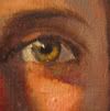
How to paint an Eye


The biggest mistake my students make in our Portrait Painting class when painting an eye, is that they try to illustrate and dissect all the parts of the iris, pupil, etc instead of painting it as a whole. Let me explain:

1. Paint out the entire eye socket with a dark color (Transparent red oxide and ultramarine blue)--think of a skeleton and the cavity of the eye socket.

2. Paint around the eye leaving the dark color as the line of the lid. A simple stroke of a a mid value will describe the eye lid., and continue underneath the eye and surrounding area.

3. Since the eyeball and eye are already almost black, let that be the dark part of the iris. Simply mix the eye color and place your brush on the inside of the cirlce.

4. The whites of the eye are never white! Use a muddy skin tone with either a hint of black or a hint of blue. Start darker than you think. Light usually hits one side of the eye stronger than the other


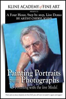
We just finished our first DVD on painting Portraits.

It's a 4 hour program -live demo and is packed with painting tips and lessons.
I made it out of frustration-my students were not progressing as I thought they should so I decided to put the instruction on DVD. I made them watch it before class and I was shocked at their instant progress. Hmm. "They'll listen to the TV but not me."

Monday, November 16, 2009

Kline Academy Student, Xavier Gonzalez wins Memorial Award at Culver City Art Show


Every year the Culver City Art group holds their annual art exhibit
featuring over 24 artists. This year we are proud that one
of our K.A Artists, Xavier Gonzalez won the Memorial Award
for his entry, Peasant boy on a stool; a master copy based on Bartolomé Esteban Murillo.
It is a beautifully painted canvas in warm earth tones with masterful blends and edges.
Xavier is a young artist who is working on perfecting his technique
in classical painting. I am sure this is the first of many of awards to
come for this promising artist.

Wednesday, September 23, 2009

Working with foils...ahhh guilding


I feel like a kid sometimes when I work with foils. I love shinny things. But somehow when I introduce gilding into my work, I am transported back to a romantic time when gold and silver adorned the finest paintings and icons. It was used then to exaggerate the light/holiness of God or the Saint who was being painted.

I am using it in this painting to exaggerate a similar idea. For the last year and a half, I have been working on a series of icon inspired paintings and researching pre-christian- judeo religions where the feminine played the dominant role.

I used this set-up for my new painting and I thought it would be a perfect lesson for our Portrait Painting class that I teach on Wednesdays from 2-5pm. The stage was set with a shinny silver back-drop, Sara, our model wore a beautiful Asian red robe. The colors reflecting in her skin are beautiful.
I started the class off with a demo on how to block in the standing form. I had everyone prime their canvas with a cool medium gray. This time, I tried a new approach to see if it would help the students to achieve more accurate proportions. We predetermined the head size and marked off 7 1/2 head lengths on the canvas. (Sara's height). This helped most of those who were doing a full figure to stay within correct proportions. Next the block-in which concentrated mostly on the silhouette--no features, no detail. AND NO WHITE. I can't believe how hard it is for some to stay away from white in the beginning but trust me, if you concentrate on all the shadow shapes, connecting half tones and mid tones, you will be so much happier with the results.
I paint with and ahead of my students in order to give them a range of solutions to the many problems that arise in portrait and figure painting. This painting of Sara, "The Goddess" is almost finished and shows our students some of the color choices I made for shadows and skin tones. I jumped ahead of them by using photographs so I could study anticipate some of the challenges they will encounter. As an instructor you can't just talk the talk...you better know how to use the brush too!

In working with foils it is important to introduce the foil layer before the painting is finished. The reflected light is so intense that it obliterates all your other lights. After I applied the foil, I went back in to adjust my lights and intensify my darks using transparent glazes of Alizarine Crimson and Ultramarine Blue and Egyptian Violet. In the strongest whites, I am using an egg tempera mixture which I will explain later.
Here is the almost finished piece.

Monday, July 6, 2009

Progression of a Portrait


I finished "Mom's" portrait in February of this year and I have to say it is so much easier to paint someone you know really well.
Mom has Parkinson's disease and typical with that disease is the blank stare. Even though she still manages now and then to crack a sarcastic joke, she is really becoming less and less able to communicate. In this portrait I wanted to capture the reality of her situation. I guess my inspiration was Whistler's Mother, Arrangement in Grey and Black. Mine however is titled "I did the best I could." Meant to be a message to those who have selfishly left their parents to fend for themselves in their dark days. It is agony to see your Mother in a state of helplessness and vulnerability. I do the best I can and see her often and of course pay for her care but it really takes a village and we all need as much help as possible to care for our elderly. It is a gift to do service for others even when they were not saints. If we all just "... did the best we could."

Friday, July 3, 2009

Kline Academy Releases Portrait Painting DVD


We are SUPER EXCITED about our first in a series of instructional DVD's that illustrate the excellent teaching offered at Kline Academy.

Kline says it best: "I designed this program because I had a student (one) drop out due to frustration. She just couldn't "get it." My ego does not allow for defeat. So I stayed up nights trying to develop a system that would be understanding to any personality with any background, skill, whatever and came up with this system. And guess what? It really, really works! I actually tested the raw video on my students. I made them watch for 30 minutes then go back into the studio and paint and WOW! We were all amazed at their progress.
I am not claiming that just by watching the DVD you will become a great portrait artist. What I am claiming is that you will be better than you were."

This four hour DVD is a live demonstration filmed on location at the Kline Academy of Fine Art. Cheryl Kline will take you step by step in her unique process of painting portraits from a photograph. There are so many lessons in this DVD you will want to watch it again and again!

Secrets Revealed! This DVD will teach you how to:
  • Find facial proportions
  • Set your composition
  • Draw your model on the canvas
  • Block in the basic shapes
  • Define the shadow patterns
  • Mix beautiful skin tones
  • Refine edges
  • Painting Hair
  • Painting Drapery
  • Finishing touches
  • and much more....
Regardless of skill level, this instructional DVD wil enable the artist to approach their next portrait project with a step by step system which will bring more success to the development of their painting techniques and practice.

"Artists of all abilities will definitely learn something from watching this. Throughout the demo Cheryl inserts gems of information that might not be gained from many hours of practical classes. She is a natural teacher and gifted artist who gererously shares her experience and skill in this demo." Barbara Rae, Professional Artist, Royal Academician, London

"I just finished watching Cheryl Kline’s video “Painting Portraits from Photographs & Finishing with the live Model.” It is so compelling. From beginning to end, the video shows the step by step method of painting from the palette, mixing the paint, drawing the initial structure, placement of the different values and then finally finishing it by looking at the live model. One of the most valuable parts of the video is to see how she uses a limited palette to produce so many colors and how to apply those colors. It is also about really seeing. Any novice or experienced painter could learn so much from this video." Judith Corona
Professional Artist, Adjunct Professor of Art, Otis College of Art + Design, UCLA Extension, Los Angeles

To Order: Call Kline Academy at (310)927-2436
$99.00